Quay Connection



The client, a financial services firm relocated to Quay Connection Sydney in January 2023. The move coincided with their new way of working post pandemic.
The 900sqm fit out delivered a blended planning model intended to promote transparency, foster a collaborative culture, and build trust between clients and staff alike.
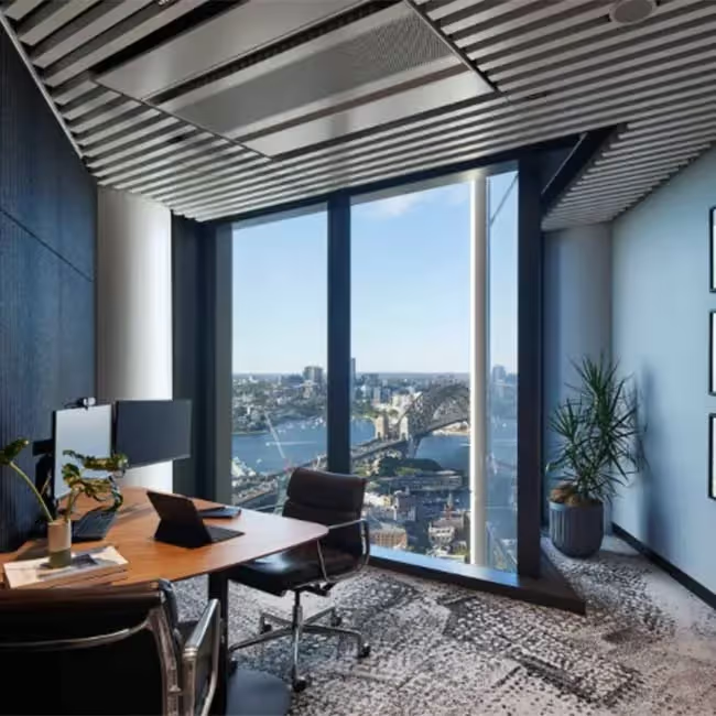
The aesthetic brief was to design a workplace that was true to its ŌĆśplaceŌĆÖ, which reinforced the company culture, provided transparency through the workspace, and created a sense of spaciousness and consideration for health and wellbeing. We considered these values and their working styles and responded with a three-tier planning approach ŌĆō designed to foster collaboration, promoted positive patterns of work, and created a forum for the exchange of ideas.
Located in Circular Quay, a significant location for the Gadigal tribe of the Eora people. We drew inspiration from the Eora PeopleŌĆÖs philosophy, which means ŌĆ£hereŌĆØ or ŌĆ£of this place,ŌĆØ and sought to reflect their connection to the land. The design replicates the organic circulation of the Sydney Harbour shoreline, creating a natural flow of people and spaces that are interconnected.
Indigenous fabrics by Willy Western were used to enhance the spaceŌĆÖs connection to the local culture and traditions. By following patterns of movement throughout a normal working day, the journey through the space was designed to be natural and organic, mimicking the natural patterns of the Sydney Harbour shoreline. Destination spaces such as meeting rooms and mingle rooms, as well as key work settings for collaboration, were all connected by fluid pathways around the space. The connection to land and the harbour environment is immediately felt when meandering through the workspace.
This design ethos helped to foster a sense of community, which reinforced the company culture. We created transparency through the workspace by omitting the traditional ŌĆśfront of house and back of houseŌĆÖ design principals to create an open work floor which was a more welcoming, engaging, and interactive experience for their clients. By nature of the clientele to the firm, most guests to the firm are familiar to staff and advised of approval through base building concierge. As such, no formal reception area or desk was necessary. Our design enables our client to foster stronger relationships, leading to increased trust, loyalty, and long-term partnerships with their clients and staff.
Blended planning was a critical design component of this project, as it provided an opportunity to share a comprehensive journey through the workspace and offer a genuine insight into the heart of the business. By showcasing its inner workings and allowing its clients to gain a deeper understanding of its operations ŌĆō the design promotes a deeper level of trust between business and clients. A core ethos of our clientŌĆÖs business.
By seamlessly blending the ŌĆśfront of houseŌĆÖ and ŌĆśback of houseŌĆÖ experience, visitors can experience how the business functions and team members collaborate with one another. Visitors may witness a client coffee in the central lounge, a live planning session in workspace and pass by desks in order to reach the meeting rooms, located away from the main arrival area.
The vacant floor plate boasted a magnificent double height void of almost 6 metres from floor level in a central location to the floor. To maximise this double height feature, Group GSA designed a statement ceiling intended to draw people towards the heart of the workspace, providing an ideal setting for gathering and exchanging ideas.
The design uses multiple Polytec batons and sheets made of ŌĆśPrime Oak WoodmattŌĆÖ laminate, installed across two heights, to mimic directional sun rays pointing towards two Barrisol light features. The tone and texture of the Polytec paired with the light features imitates warmth and natural sunlight, incorporating biophilic design principles that enhance the ambience of the workspace and support employee wellbeing. By directing the batons in from the workspace and towards the central light feature we created a focal point that acts as an anchor, encouraging people to gather from across the office to further enhance culture. The curved shape of the feature ceiling positioned amongst the smooth surrounding ceiling is inspired by the harbour and its islands.


